What Exactly Is a Ductus?!
The key to drawing and joining script letters smoothly
One of the most mesmerizing things about script lettering is the way the forms flow so effortlessly from one to the next. Even though I don’t write in cursive (despite being forced to back in grade school), there’s one thing from penmanship class that came in handy when I started lettering: the ductus.
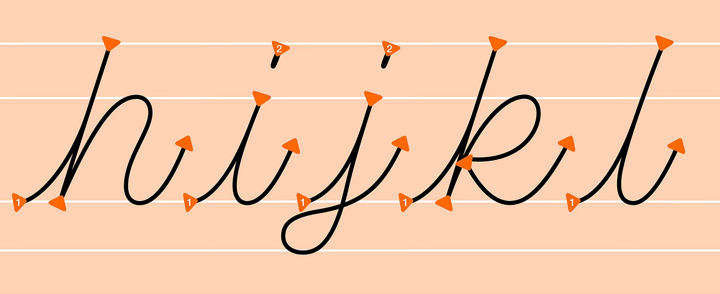
Knowing the order and direction of strokes is key to smooth script.
A ductus shows the correct sequence and direction of a letter’s strokes. But, it isn’t something you can simply make up—centuries of tradition have shaped how cursive letters look today. That’s why understanding how they’re properly constructed and connected is essential for creating natural-looking, readable script logos and wordmarks.
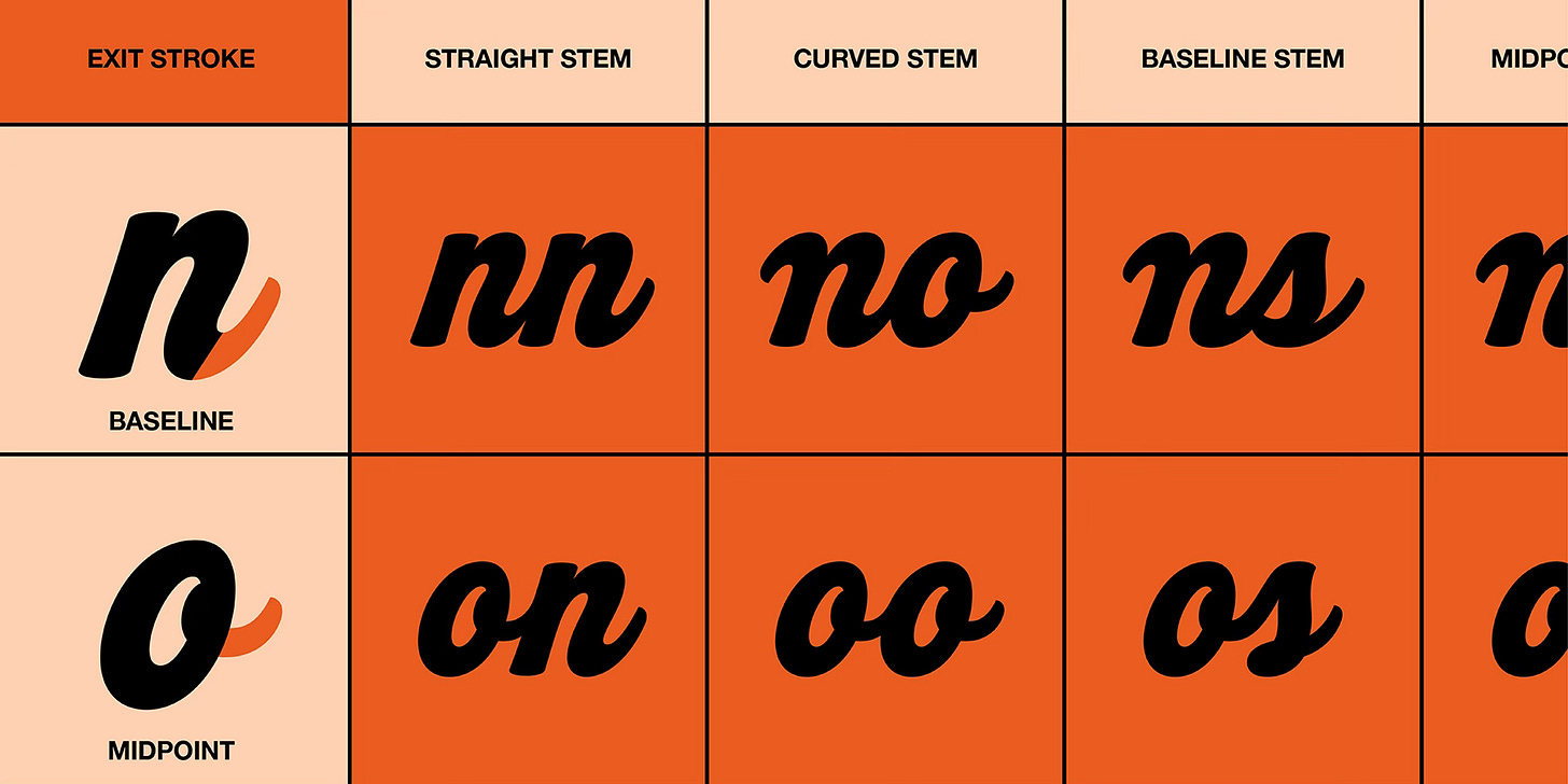
Letters can connect at the base, top, or midpoint—each altering their flow.
Thick and curvy script lettering makes things even trickier, since you have to balance the letterforms’ hefty volume while maintaining a smooth, fluid movement. Sometimes, the ductus itself can be adjusted to accommodate the unique demands of bold script—but only when you know the right way to bend the rules.
Some letters have multiple options for how they’re formed and linked.
We’ll dig into all of this (and plenty more) in our upcoming online workshop, Juicy Script Lettering. You’ll learn must-know techniques for building and joining heavyweight cursive forms, plus you’ll get a free illustrated PDF guidebook, an optional bonus workbook, and access to the class recording if you can’t make it live. Perfect for any skill level—save your spot and start drawing juicy script with ease!
See you there!
Ken


